Monday 14 March 2011

Completed Ancillary Tasks

These are the completed ancillary tasks for my band.


This is the advertisement. The colour scheme is very dark with a striking blood red. It also features a heart which works well as it connects to the digi pack which also has a heart of the back cover.


This is the completed digi pack. There is an overall theme kept with it as it is mostly dark with a lot of red. There is some lighter images but this works as there is blood on it which is quite disturbing.

Sunday 13 March 2011

What have you learned from your audience feedback?

We then asked 5 people that were of our target audience to view the film we had made as well as the magazine advertisement and the digi pack. We asked them what genre they thought it was, to which they all said rock. This was very promising as this was what we were aiming for. The reasons for them thinking this were things such as, the band members playing their instruments in the video. Also they noted the dark colours and the theme of bright red worked well as well as the sense of blood that was apparent.

They said that it needed to be finished, which we knew but it was very close to being finished anyway. Also the green screen needed editing out, but we had put effects on the studio shots to make them fit the theme and convention which must have worked as they didn't mention that they were to bright/pink. This can been seen in the first draft of the video. On the green screen shots it was said that the outer glow of green around the people needed taking out but this was very hard to get perfect, however in the end it looked really good.

I took this feedback on board and now the pink shots look and suit the genre much better as you can see from the video below.

What have you learned from your audience feedback?

Once we had made the changes suggested by our peers, we then handed in a second draft of the products for our teachers to assess.

They suggested that some of the fonts looked too cheesy so we changed this to a more gritty/scratchy one which worked better as it was more serious but still in blood. The use of blood is important because it is widely associated with this genre of music, it symbolises pain, and the colour shows danger which is something this genre is about. For example when playing live shows the audience "mosh" which means they go crazy and bump and hit each other. Also one of the panels on the digi pack needed a new photo as the old one was very untidy and didn't look very good.

We used this font:
We then made these changes as well giving us an overall better and more professional set of products.

Wednesday 9 March 2011

What have you learned from your audience feedback?

For my first draft of the music video and ancillary tasks the class had to mark each others work. We all went around and marked each piece of work.

From my initial audience feedback from the people in my class I learnt of a few things that needed changing/altering. For example adding more album reviews on the advertisement as there was only one from Kerrang. Also making the band name bigger as the band was the main focus of the advertisement, I also moved the album and band names around on the poster to make them more clear, but also just to make the overall layout look better and look more professional. Some positive points were that the digi pack and poster suited the genre they were meant for.

For my video it was said a lot that it needed to be finished which was obvious. Some shot were very long and needed to be made shorter otherwise it would not fit conventions. All of the shots that were shot in the studio were too bright and pinkish. This was due to the fact the camera takes in different amounts of light making it seem different on camera. The story in the music video also needed to be more prominent throughout the whole video, as it was only really seen near the beginning. It was noted that we had a strong performance and it was synced very well.


I think people pointed out that the poster needed more reviews because real life products would more than often include more than one review on them.

How did you use media technologies in the construction and research, planning and evaluation stages?

Tripod and Camera

The footage for our music video was taken with a digital video camera. This, obviously, was essential in creating the music video as without any footage there is no video to create. It uses an SD card for storage which meant that uploading footage was much easier as we didn't have to rewind tapes.
Also the tripod was very important as it aloud nice, steady shots, allowing the music video to look more professional and not amateurish. It also aloud movement such as panning and craning but all the time keeping these shots steady and not shaky.

How did you use media technologies in the construction and research, planning and evaluation stages?

When constructing the music video, the digi pack and the advertisement I used two main pieces of software. These were Final Cut and Photoshop. Before I could use these though I recorded my footage with digital video cameras, sometimes using three at a time to keep things in sync. I also used the fig rig to get steady hand held shots which were useful when it came to editing. I used a HD camera which had a slow motion feature on it. The green screen was very useful as I was able to then put anything in the background of the performers.

Using Final Cut was hard at first but became very simple after a while. Using tools such as the blade and the pen (as seen above) and putting on effects like the chromer key which was used for the greenscreen shots. Photoshop also became much easier to use after a little while. Making each object a different layer was very helpful as things could be moved, changed or deleted without affecting any other part of the product. A useful website that I used was www.dafont.com. This has thousands of different fonts that you can download giving me much more choice of fonts when writing of the ancillary tasks.

..............................................

The first image is the Photoshop Tool Bar used to edit the various aspects of the digi pack and advertisement.

The second image of the different layers used for the advertisement.

How did you use media technologies in the construction and research, planning and evaluation stages?

I used technologies to help me research music videos, CD packages and advertisements for my genre of music. I primarily used the internet to view these mediums, websites such as YouTube were very helpful as I could watch loads of music videos and analyse them, also the basics such as watching them and seeing them on television as well.


Blogger was also used to publish my research so that others could see and comment on it. This information could then be put to use in making my products better.


A website called "dafont" allowed me to view and if needed download thousands of different fonts. The fonts that come with the software were limited and we couldn't find a suitable one so this really helped.

How did you use media technologies in the construction and research, planning and evaluation stages?

When planning both the music video and the ancillary tasks I used a number of technologies to help me. Firstly I used a digital camera to take photographs. These were of possible locations as well as of things that could be used on the ancillary tasks. Also I used Photoshop for the first time, as I made a mock CD front and back cover to just get a feel for the software and what it would be like when creating the real thing. I used Final Cut for the first time as well, we recorded as a class some people playing and singing along to a song and then I imported this to Final Cut and edited it to make it sync with the song.

The main photo used on the advertisement before the editing stage, PhotoShop was able to edit out everything that I didn't ned such as the brick wall.
One of the photos used on the digi pack before the editing stage, this one was used for the back cover. This photo was used in full as we didn't want to get rid of the back ground or any part of it because the contrast that was created work very well.

Wednesday 2 March 2011

How effective is the main combination of your main product and ancillary texts?

Both tasks work very well together as they share similar themes that fit the genre of the band. For example they all stick with a darker colour scheme using black and red a lot. As you can see below the poster advertisement mainly uses these two colours as well as the backgrounds that are used on the green screen sections of the music video which features a series of gritty images using grey, black and red which can be seen on the video below.

This genre is commonly associated with darkness but also with bright, striking red that shows pain and danger. The band is not a bright, happy auto tuned produced pop band but a real, authentic band that is showing feeling through their music.

How effective is the main combination of your main product and ancillary texts?

The products also work well together as they both show the genre for what it is known for. This being that it has a more authentic, real quality to it. It doesn't over do it with synthesisers and electronic sounds but focuses on the sound the actual instruments make which is also a reason that bands of this genre give popular live performances. The Digi pack shows the full band and the video shows a lot of the band performing with their instruments.

The image on the left is from the music video, it shows the guitarist playing his guitar, the image on the right features the same guitar used on one of the panels on the Digi pack. This genre is know for the band members playing there instruments live.

In what ways does you media product use, develop or challenge forms and conventions of real media products?

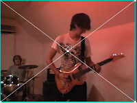
Through thorough research of my genre, I came to the conclusion that the majority of rock/metal videos include these conventions:

-Band members playing instruments.
-Fast paced music.
-Band members doing a lot of "head banging" and upper body movement.
-They have a lead singer, that doesn't always have an instrument but can do.
-Videos often have low key lighting and feature a lot of red.
-Narratives often feature a love story but this may be shown in a less romantic way, possibly being more violent.

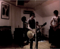
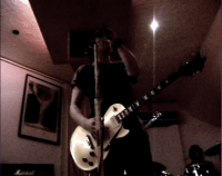
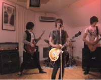
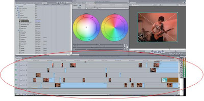
My video includes these conventions, as the images below show the low key lighting, the male band members playing instruments, as well as shots that focus on the singer.


In what ways does you media product use, develop or challenge forms and conventions of real media products?

From researching the genre, I found that in a lot of music videos the lead singer does not have a guitar (or any instrument), however in some they did. In my music video we have the lead singer with a guitar but also show him in different locations with out a guitar. This allowed the cross cutting of different locations but showing both the singer with (Left image) and without the guitar (Right image), as you can see below.


Also, professional videos use a lot of effects because they have the software to do it. Final Cut Express has a lot of effects that we used well, for example a repeating theme in our song is "I'm not insane" so we did some strange effects. The video is of the lead actor going "insane", this shot then sort of ghosts in to the next shot of the lead singer.


The music video also primarily features the whole band playing their instruments together as they would when giving a live performance. The video however does focus more on the lead singer, which is a common connotation of most music videos.

In what ways does you media product use, develop or challenge forms and conventions of real media products?

A common connotation of music videos of bands of this genre, is a fast pace, with quick cuts and edits. As you can see below my music video has many cuts that vary in length depending of the tempo of the song which changes throughout.


In what ways does you media product use, develop or challenge forms and conventions of real media products?

On one of the panels on the Digi pack that I created I have used the image of a real heart, placed on snow. This image works well with the conventions of the genre as the contrast between the red of the blood and the snow makes a strong impact and is quite disturbing, as bright red is a very common colour used in this genre.

This is good because album covers of this genre are made to stand out and be different so that they get noticed. They use images that are targeted at a specific audience and so are not afraid to use images that may upset a more generalised audience, that of which would follow "pop" music. These images would appeal to the targeted audience because that would be the culture they are in to, they would expect this of a band of this genre.

In what ways does you media product use, develop or challenge forms and conventions of real media products?

Similar but still different to the Digi Pack, the advertisement poster also features a heart. This is being squeezed by a hand which again is quite gruesome. The main colour is black which is typical of this genre and also has a lot of red on it which is quite striking and works very well with the heart being present on the poster, as the audience associates the heart with blood which is red. The heart has an effect placed on it to make it seem more or a graphical image. This was done because a lot of advertisements/albums often have some kind of graphical artwork on them.


This is the finished product.

Applying the effects using Photoshop. Applying this effect was done because the heart on its own didn't look right, we had already featured a heart on the Digi pack, but that was on the back and wasn't the main image. On this poster we chose to give it a graphical feel, like it had been drawn because this genre is associated with gritty, arty, graphical drawings, that are not perfectly defined but may resemble "sketches".

In what ways does you media product use, develop or challenge forms and conventions of real media products?

The genre of the song I used warrants a lot of fast cutting throughout. This can be seen on the video below which shows the drummer performing. The cuts mimic the beat he is playing which works well. Cutting quickly at points also works well because the audience doesn't become bored with static shots, they are fast and energetic.

Click here for an updated view of this video.

This is an example of a real music video that cuts with the drummer, the faster the drummer, the faster the cutting.