Similar but still different to the Digi Pack, the advertisement poster also features a heart. This is being squeezed by a hand which again is quite gruesome. The main colour is black which is typical of this genre and also has a lot of red on it which is quite striking and works very well with the heart being present on the poster, as the audience associates the heart with blood which is red. The heart has an effect placed on it to make it seem more or a graphical image. This was done because a lot of advertisements/albums often have some kind of graphical artwork on them.
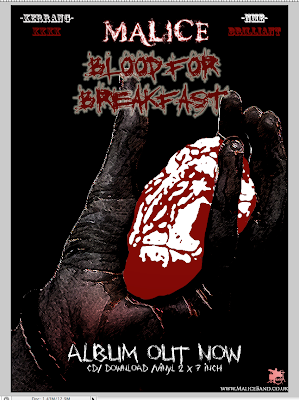
This is the finished product.
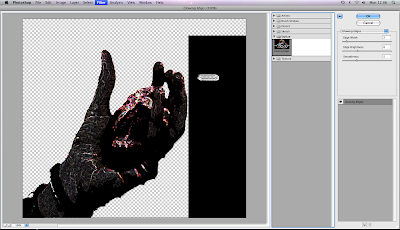
Applying the effects using Photoshop. Applying this effect was done because the heart on its own didn't look right, we had already featured a heart on the Digi pack, but that was on the back and wasn't the main image. On this poster we chose to give it a graphical feel, like it had been drawn because this genre is associated with gritty, arty, graphical drawings, that are not perfectly defined but may resemble "sketches".
might want to rearrange the 'finished product' and 'applying the effects using photoshop'. You don't really talk about how you use, develop or challenge the conventions explicitly.
ReplyDeleteReal examples!!!!!!! Then take time to specifically explain the conventions- and then if you used them or not.
ReplyDeleteMCU.