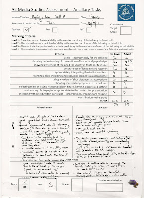
From my initial audience feedback from the people in my class I learnt of a few things that needed changing/altering. For example adding more album reviews on the advertisement as there was only one from Kerrang. Also making the band name bigger as the band was the main focus of the advertisement, I also moved the album and band names around on the poster to make them more clear, but also just to make the overall layout look better and look more professional. Some positive points were that the digi pack and poster suited the genre they were meant for.
For my video it was said a lot that it needed to be finished which was obvious. Some shot were very long and needed to be made shorter otherwise it would not fit conventions. All of the shots that were shot in the studio were too bright and pinkish. This was due to the fact the camera takes in different amounts of light making it seem different on camera. The story in the music video also needed to be more prominent throughout the whole video, as it was only really seen near the beginning. It was noted that we had a strong performance and it was synced very well.

I think people pointed out that the poster needed more reviews because real life products would more than often include more than one review on them.
why do you think people thought adding more reviews to your album was necessary?
ReplyDeletecould get some images of actual comments backing up the points that were made by your peers rather than bunging in just the teacher evaluation at the end
This is useful, but a bit dry and boring. Where else did you get feedback from- (not just us fuddy-duddies!) How can you make this post more visual and exciting and 'genuine'?
ReplyDeleteMCU