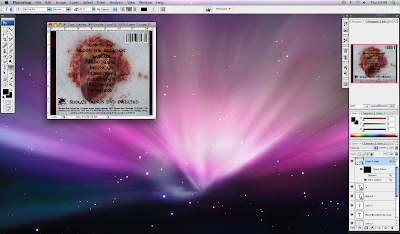
On one of the panels on the Digi pack that I created I have used the image of a real heart, placed on snow. This image works well with the conventions of the genre as the contrast between the red of the blood and the snow makes a strong impact and is quite disturbing, as bright red is a very common colour used in this genre.

This is good because album covers of this genre are made to stand out and be different so that they get noticed. They use images that are targeted at a specific audience and so are not afraid to use images that may upset a more generalised audience, that of which would follow "pop" music. These images would appeal to the targeted audience because that would be the culture they are in to, they would expect this of a band of this genre.
might want to use some examples (... and ting). Still need to talk more explicitly about specific conventions that you have used challenged or developed.
ReplyDeleteBut this does not really tell me how you have used conventions- you have just told me the meaning. Why is this conventional/not?
ReplyDeleteMCU